Revolutionizing PayPal: The Largest Atlassian Cloud Migration in History
PayPal, a global leader in online payments, faced significant challenges with their existing infrastructure, which…
Explore practical insights, strategic POVs, and emerging trends from the team driving enterprise transformation forward.

Learn how Atlassian Rovo works across Jira and Confluence, including AI search, Rovo Agents, automation, governance, and adoption.

Learn how AI transforms business capability management into real-time decision intelligence that improves execution, governance, and outcomes.

Learn how embedded AI governance helps enterprises balance execution speed, accountability, and operational control at scale.
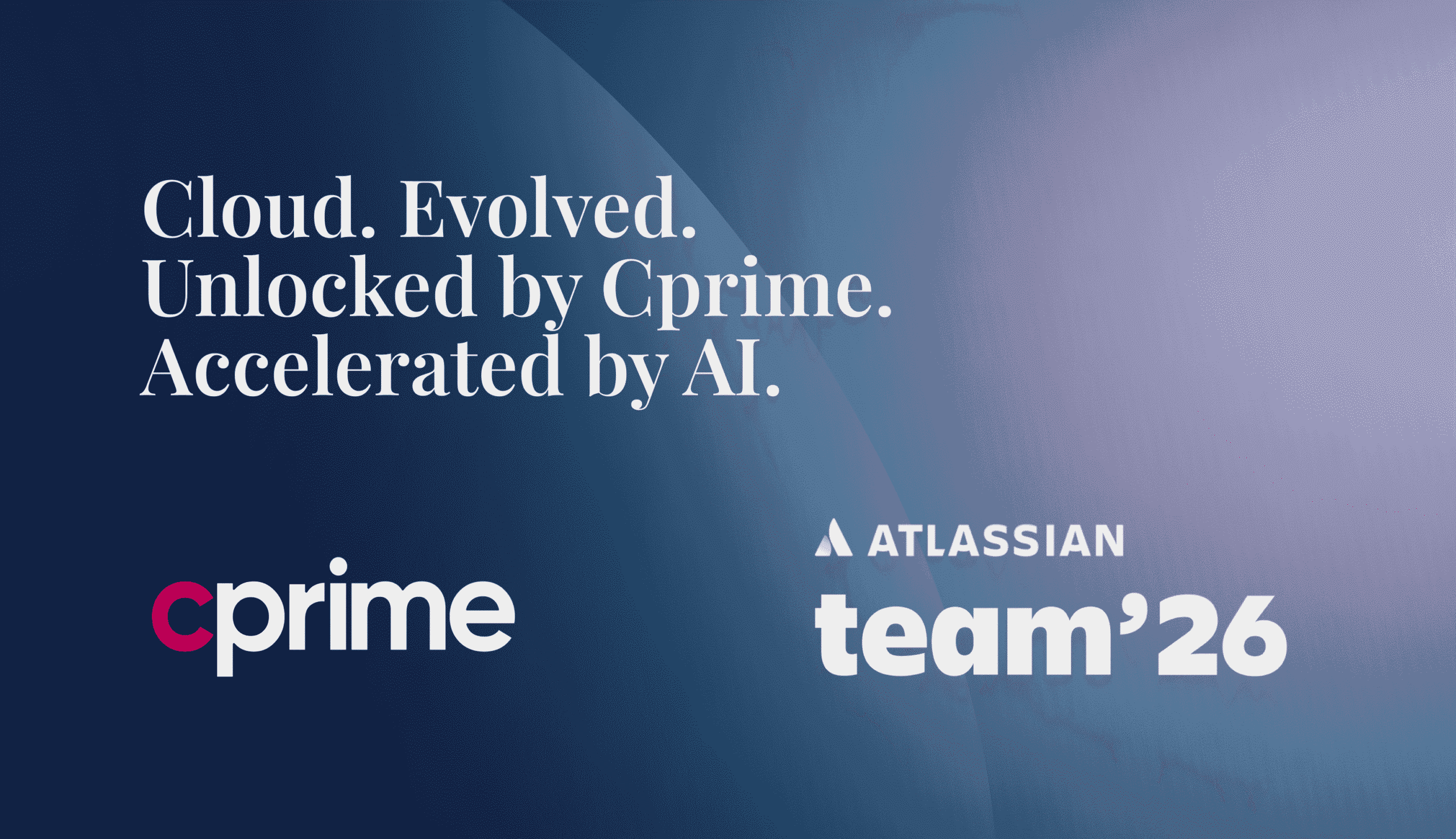
Explore what Atlassian Team 2026 revealed about Teamwork Graph, Rovo, connected workflows, and enterprise AI execution.
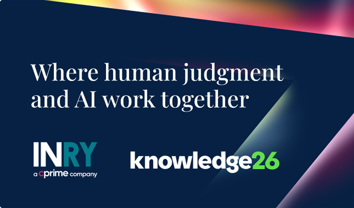
ServiceNow Knowledge 2026 revealed how orchestration, governance, and agentic AI are reshaping enterprise operating models.

AI adoption ROI depends on workflow execution, not usage. Learn how to connect AI to real business outcomes and enterprise performance.

Discover why AI projects fail to scale and how to overcome AI implementation challenges in enterprise environments.

Learn why AI programs outperform projects and how to scale AI value through continuity, adoption, and measurable outcomes.
FAQs on Atlassian system of work assessment, ROI, adoption gaps, and AI readiness for enterprise teams.